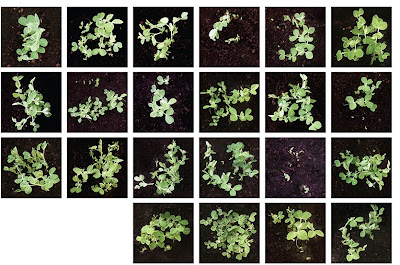
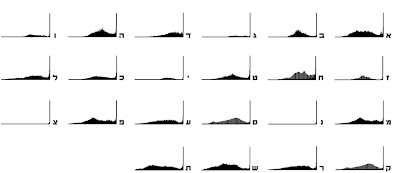
Yes you’re looking at a font that grows! Haim Organic is a project by Israeli artist Tirza Ben Porat which was influenced by Gaston Bachelard’s “The Poetics of Space” in which it is stated that “inhabited space transcends geometrical space”. Tirza decided to check this statement by getting the most geometrical Hebrew font Haim inhabited.
The Haim font was designed by Jan Lewitt in 1929 in Poland as a display face influenced by the Bauhaus and early modernism. It holds seven symmetrical letterforms and involves simplified, constructed and geometrical forms. More info can be found here.
Tirza made small plastic stencils and planted laboratory peas then followed the font’s growth over 30 days, taking daily photos and measurements.
The most interesting transformations happened during the first 20 days after seeding, after which the growth got out of hand and the letters became indecipherable.
“I could no longer separate one letter from the other. The peas took a form of their own. The outcome was quite random as some letters outlasted others and some simply did not grow much after sprouting.”
A font like this would be perfect for Sow ‘n Sow, if only they were english letters but then it wouldn’t be quite so interesting. Thank you Tirza for the in depth information. Her many other interesting projects can be found here.
Be sure to click on the images to see the growth sequence.


